温故而知新,学习一下 ggplot2 饼图
其实 ggplot2 并没有类似于 geom_pie() 这样的函数实现饼图的绘制,它是由 geom_bar() 柱状图经过 coord_polar() 极坐标弯曲从而得到的。
对于为什么 ggplot2 中没有专门用于饼图绘制的函,有人说:“柱状图的高度,对应于饼图的弧度,饼图并不推荐,因为人类的眼睛比较弧度的能力比不上比较高度(柱状图)”。关于饼状图被批评为可视化效果差,不推荐在 R 社区中使用的文章在网络也有不少,感兴趣的可以去搜一下。
不管怎么说,学习一下总不是坏事,趁着一些客户刚好对饼图有需求,学习重温一下。
极坐标系
极坐标应该是高中数学的知识,对我而言,基本都已经忘光了,结合网上的一些资料重温一下。
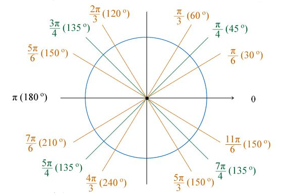
极坐标是指在平面内取一个定点 O,叫极点,引一条射线 Ox,叫做极轴,再选定一个长度单位和角度的正方向(通常取逆时针方向)。对于平面内任何一点 M,用 ρ 表示线段 OM 的长度(有时也用 r 表示),θ 表示从 Ox 到 OM 的角度,ρ 叫做点 M 的极径,θ 叫做点 M 的极角,有序数对 (ρ, θ) 就叫点 M 的极坐标,这样建立的坐标系叫做极坐标系。通常情况下,M 的极径坐标单位为 1(长度单位),极角坐标单位为 rad(或 °)。
极坐标系中一个重要的特性是,平面直角坐标中的任意一点,可以在极坐标系中有无限种表达形式。通常来说,点(r, θ)可以任意表示为(r, θ ± n×360°)或 (−r, θ ± (2n + 1)180°),这里 n 是任意整数。如果某一点的 r 坐标为 0,那么无论 θ 取何值,该点的位置都落在了极点上。
笛卡尔坐标和极坐标之间的转换,请参考数学乐网站的《极坐标与笛卡尔坐标》一文,非常详细直观。
coord_polar
coord_polar() 是 ggplot2 中的极坐标函数,它可以弯曲横纵坐标,使用这个函数做出蜘蛛图或饼图的效果。我在网络上查了一下,比较少看到关于 coord_polar() 原理的介绍,只是在 ggplot2 的 Tidyverse 上发现了几个例子。
library(ggpubr)
library(ggplot2)

df <- data.frame(name = c("A", "B", "C"), value = c(10, 50, 30))
p <- ggplot(df, aes(x=name, y=value, fill=name)) + geom_bar(stat="identity", width=1, colour="black")
g <- ggplot(df, aes(x="", y=value, fill=name)) + geom_bar(stat="identity", width=1, colour="black")
用法
coord_polar() 主要有四个参数: theta, start, direction 和 clip 。
coord_polar(theta = "x", start = 0, direction = 1, clip = "on")
- theta:variable to map angle to (
xory). - start:offset of starting point from 12 o’clock in radians.
- direction:1, clockwise; -1, anticlockwise.
- clip:Should drawing be clipped to the extent of the plot panel? A setting of
"on"(the default) means yes, and a setting of"off"means no.
小知识:角度制 vs 弧度制 > ** 1 度=π/180≈0.01745 弧度,1 弧度=180/π≈57.3 度。
角的度量单位通常有两种,一种是角度制,另一种就是弧度制。 角度制,就是用角的大小来度量角的大小的方法。在角度制中,我们把周角的 1/360 看作 1 度,那么,半周就是 180 度,一周就是 360 度。由于 1 度的大小不因为圆的大小而改变,所以角度大小是一个与圆的半径无关的量。
弧度制,顾名思义,就是用弧的长度来度量角的大小的方法。单位弧度定义为圆周上长度等于半径的圆弧与圆心构成的角。由于圆弧长短与圆半径之比,不因为圆的大小而改变,所以弧度数也是一个与圆的半径无关的量。角度以弧度给出时,通常不写弧度单位,有时记为 rad 或 R。
参数示例
结合一些示例,理解一下 coord_polar() 的几个参数。
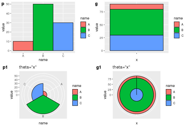
- theta=”x”
** x 轴极化,x 轴刻度值对应扇形弧度,y 轴刻度值对应圆环半径。p 中由于 x 是等长的,所以 p1 每一个弧度为 60 度;p2 的每一个弧度为 360 度。
p1 <- p + coord_polar(theta="x") + labs(title="theta=\"x\"")
g1 <- g + coord_polar(theta="x") + labs(title="theta=\"x\"")
ggarrange(p, g, p1, g1, ncol=2, nrow=2, labels=c("p", "g", "p1", "g1"))
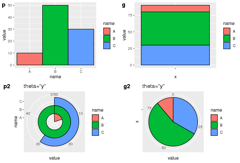
- theta=”y”
** y 轴极化,y 轴刻度值对应扇形弧度,x 轴长度对应扇形半径。对于并列柱状图 p**,以最大的 y 值作为 360 度的弧度,剩下的按比例类推,由于 p 中 A、B、C 是等长的,所以在 p1 中它们的半径是 1:2:3。对于堆叠柱状图 g**,把 y 值按照比例划分弧度,因此它们的弧度比等于各自的 y 值比例。 **
p2 <- p + coord_polar(theta="y") + labs(title="theta=\"y\"")
g2 <- g + coord_polar(theta="y") + labs(title="theta=\"y\"")
ggarrange(p, g, p2, g2, ncol=2, nrow=2, labels=c("p", "g", "p2", "g2"))
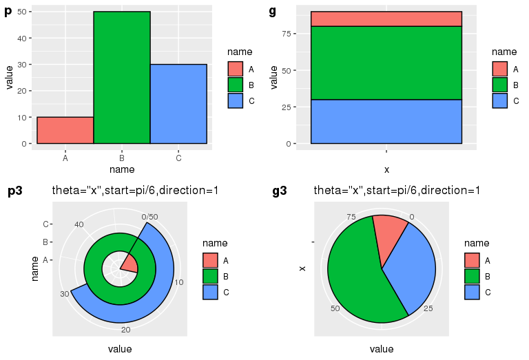
- start=pi/6, direction=1
** 起始位置为距离 12 点针方向 30 度,顺时针排列。 **
p3 <- p + coord_polar(theta="y", start=pi/6, direction=1) + labs(title="theta=\"x\",start=pi/6,direction=1")
g3 <- g + coord_polar(theta="y", start=pi/6, direction=1) + labs(title="theta=\"x\",start=pi/6,direction=1")
ggarrange(p, g, p3, g3, ncol=2, nrow=2, labels=c("p", "g", "p3", "g3"))
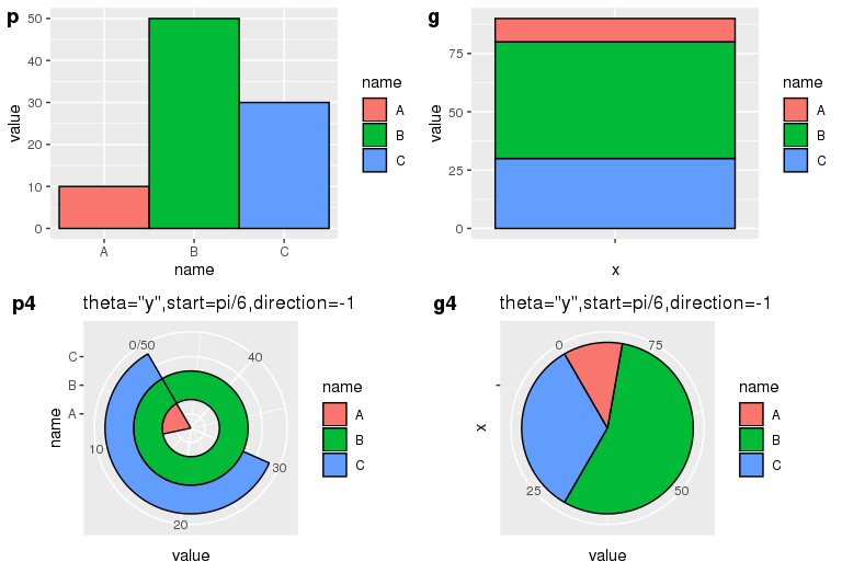
- start=pi/6, direction=-1
起始位置为距离 12 点针方向 30 度,逆时针排序。
p4 <- p + coord_polar(theta="y", start=pi/6, direction=-1) + labs(title="theta=\"y\",start=pi/6,direction=-1")
g4 <- g + coord_polar(theta="y", start=pi/6, direction=-1) + labs(title="theta=\"y\",start=pi/6,direction=-1")
ggarrange(p, g, p4, g4, ncol=2, nrow=2, labels=c("p", "g", "p4", "g4"))
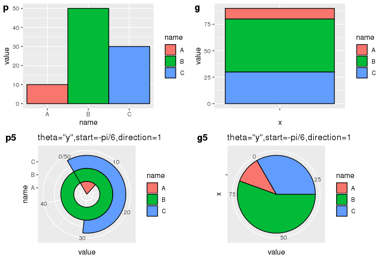
- start=-pi/6, direction=1
起始位置为距离 12 点针方向负 30 度,顺时针排序。
p5 <- p + coord_polar(theta="y", start=-pi/6, direction=1) + labs(title="theta=\"y\",start=-pi/6,direction=1")
g5 <- g + coord_polar(theta="y", start=-pi/6, direction=1) + labs(title="theta=\"y\",start=-pi/6,direction=1")
ggarrange(p, g, p5, g5, ncol=2, nrow=2, labels=c("p", "g", "p5", "g5"))
Github 上有关于 coord-pola.r 的源码,整个代码只有 300 多行,有兴趣的同学可以去研究一下,上面的理解如有不对的地方还请看官们帮忙指正。
饼图中添加文字的位置控制 - 借助公式
绘制饼图的过程中,利用 ggplot2 的 geom_bar 结合 coord_polar 实现。
# Load ggplot2
library(ggplot2)

# Create Data
data <- data.frame(group=LETTERS[1:5], value=c(13,7,9,21,2))

# Basic piechart
ggplot(data, aes(x="", y=value, fill=group)) +
  geom_bar(stat="identity", width=1) +
  coord_polar("y", start=0)
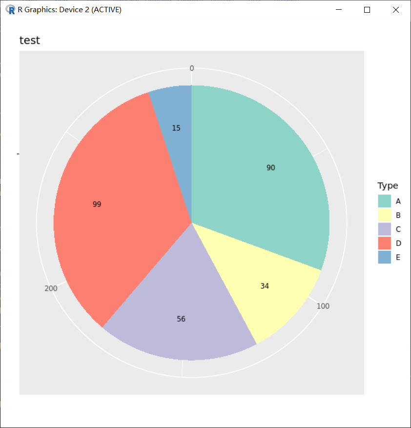
需要理解的点是饼图的排布是按照 aes(fill) 的因子顺序确定的。譬如数据如下:
> dat <- data.frame(type=LETTERS[1:5], Num=c(90, 34, 56, 99, 15))
> dat
  type Num
1    A  90
2    B  34
3    C  56
4    D  99
5    E  15
必须根据数据先确定 mapping 中 aes(fill) 的因子顺序,譬如这里会按照 dat$type 填充,这种非有序因子会基于字母顺序来默认其填充顺序。
为了确定数据填充的先后,同时方便在不同区域上填写上对应数据的大小,所以会先去创建有序因子,从而使数据列 dat$Num 的自然顺序和因子的顺序在一定程度上一致(一致的同向对应或反向对应)。譬如如下使方向一致:
dat$type <- factor(dat$type,levels = dat$type,order=T)
dat$type
有序因子的结果则如下,和 dat$Num 的顺序能够一致上,不会出现对应错乱问题。
[1] A B C D E
Levels: A < B < C < D < E
画图:
p_pie <- ggplot(dat, aes(x="", y=dat[,2], fill=dat[,1]))+
  geom_bar(stat="identity", width=1)+
  coord_polar(theta="y", direction=1)+
  scale_fill_brewer(palette ="Set3", direction = 1)+
  labs(x="", y="", fill="Type")+
  ggtitle(label ="test", subtitle=NULL)
p_pie
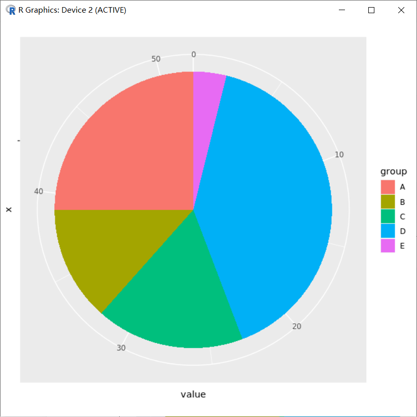
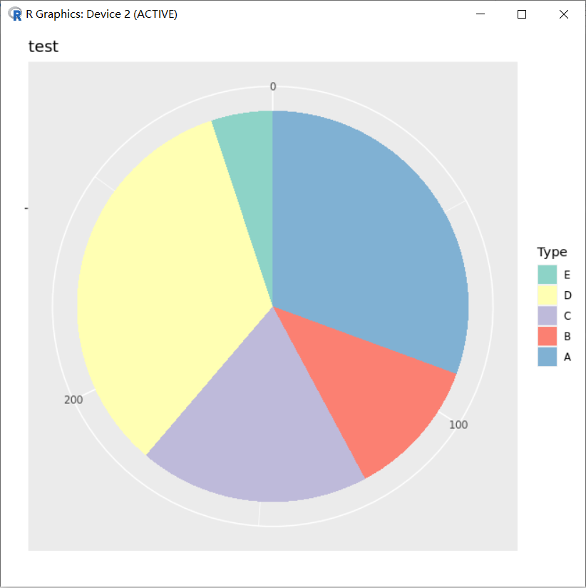
结合下图结果可以看出坐标轴方向使顺时针,而颜色设置 scale_fill_brewer(palette ="Set3",direction = 1) 设定了第一个颜色填充到第一个因子对应的 “A” 上,这样就反映出在图片实际分布中数据和因子是反向对应的。虽然在 dat 数据框中设置是顺序一致方向相同的对应,但图片分布中会改变。
小知识:scale_fill_brewer
scale_fill_brewer 是一个 ggplot2 和 RColorBrewer 关联的一个扩展调色板,其他可用于 scale_fill_brewer 调色板的颜色包括:
Diverging BrBG, PiYG, PRGn, PuOr, RdBu, RdGy, RdYlBu, RdYlGn, Spectral Qualitative Accent, Dark2, Paired, Pastel1, Pastel2, Set1, Set2, Set3 > Sequential Blues, BuGn, BuPu, GnBu, Greens, Greys, Oranges, OrRd, PuBu, PuBuGn, PuRd, Purples, RdPu, Reds, YlGn, YlGnBu, YlOrBr, YlOrRd
参考:https://ggplot2.tidyverse.org/reference/scale_brewer.html
结合图片中反向对应的关系,在 A 区块上中间位置填充上对应的文字 “Num:90”,它的坐标因该是 sum(dat$Num)-90 +90/2 ;如果是 B 区块对应的应该坐标为 sum(dat$Num)-90-34 +34/2 ,归纳为:sum(dat\(Num)-cumsum(dat\)Num)+dat$Num/2,即:
> sum(dat$Num)-cumsum(dat$Num)+dat$Num/2
[1] 249.0 187.0 142.0  64.5   7.5
小知识:R 语言 cumsum 函数 > ** >
cumsum是 R 语言base包 cum 系列的一个函数,它的功能是计算向量的累积和并返回。cum 系列还有另外三个函数:cumprod,cummin,cummax,它们的作用分别是计算向量的累积的乘积、极小值、极大值,并返回。
# 对数值型向量求和
> cumsum(1:10)
 [1]  1  3  6 10 15 21 28 36 45 55

# 对数值型矩阵求和,结果返回仍是向量
> cumsum(matrix(1:12, nrow = 3))
 [1]  1  3  6 10 15 21 28 36 45 55 66 78

# 对数据框求和,返回结果仍然是数据框,cumsum 会对对每个变量进行求和处理
> cumsum(data.frame(a = 1:10, b = 21:30))
    a   b
1   1  21
2   3  43
3   6  66
4  10  90
5  15 115
6  21 141
7  28 168
8  36 196
9  45 225
10 55 255
结合 geom_text(aes(x,y)) 的位置设置,保证中间文字填写不会出错:
p_pie=p_pie+
  geom_text(aes(x=1.2,y=sum(dat$Num)-cumsum(dat$Num)+dat$Num/2 ,label=as.character(dat[,2])),size=3)
p_pie

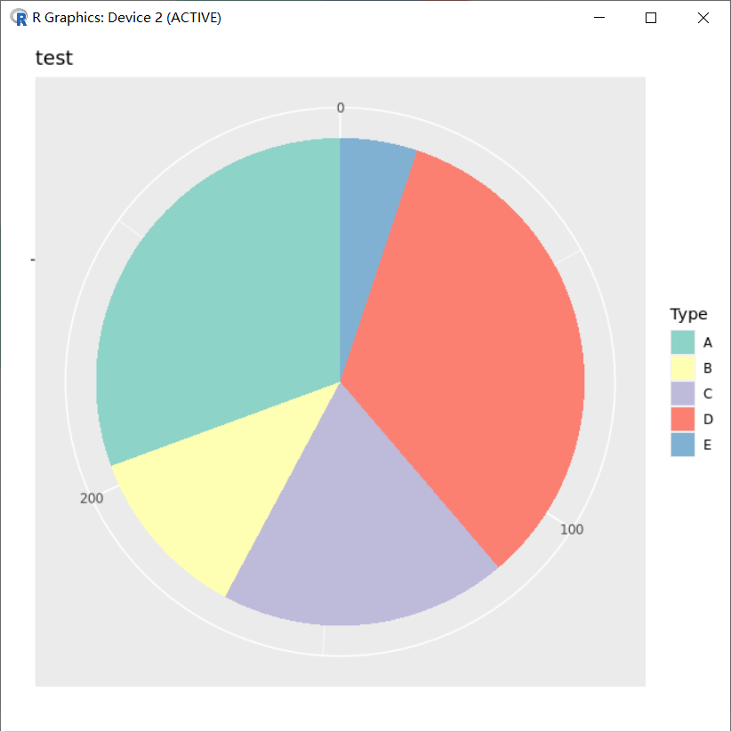
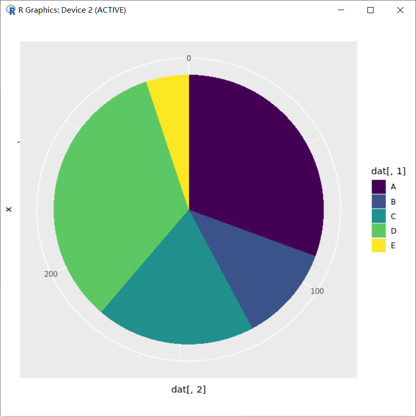
如果最初构建有序因子的方向和实际数据的方向反向对应呢?
dat$type=factor(dat$type,levels = rev(dat$type),order=T)
dat$type

p_pie=ggplot(dat,aes(x="",y=dat[,2],fill=dat[,1]))+
  geom_bar(stat="identity",width=1)+
  coord_polar(theta="y",direction=1)+
  scale_fill_brewer(palette ="Set3",direction = 1)+
  labs(x="",y="",fill="Type")+
  ggtitle(label ="test",subtitle=NULL)
p_pie
结合图片可以知道,第一个因子 “E” 对应了第一个颜色,不过从图片显示坐标中可以看到,”A” 在前,而 “A” 在原始数据 dat$Num 中对应的数据也在前 90,这样计算位置就会发生改变了,这时候 “A” 文字应该对应 90-90/2,文字 “B” 将对应 90+34-34/2,…,归纳为 cumsum(dat$Num)-dat$Num/2 。
> cumsum(dat$Num)-dat$Num/2
[1]  45.0 107.0 152.0 229.5 286.5
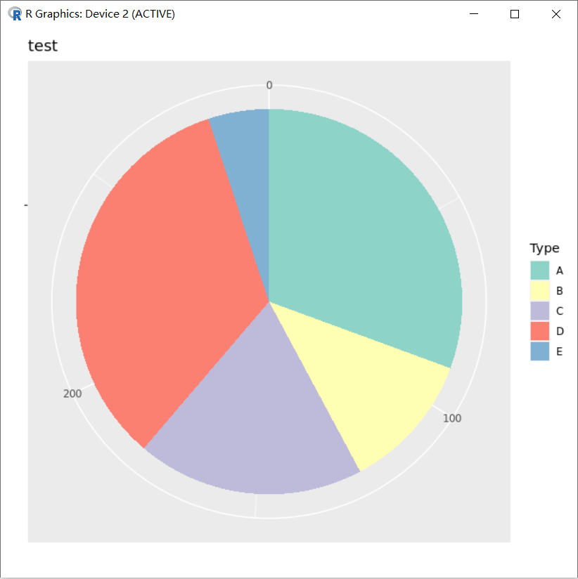
而且图例也是反向的,需要结合 guides(fill=guide_legend(reverse=T)) ,并且希望第一个颜色对应最后一个因子 “A”, scale_fill_brewer(palette ="Set3",direction = -1) :
dat$type=factor(dat$type,levels = rev(dat$type),order=T)
dat$type

p_pie=ggplot(dat,aes(x="",y=dat[,2],fill=dat[,1]))+
  geom_bar(stat="identity",width=1)+
  coord_polar(theta="y",direction=1)+
  scale_fill_brewer(palette ="Set3",direction = -1)+
  labs(x="",y="",fill="Type")+
  ggtitle(label ="test",subtitle=NULL)+
  guides(fill=guide_legend(reverse = T))+
  geom_text(aes(x=1.2,y=cumsum(dat$Num)-dat$Num/2 ,label=as.character(dat[,2])),size=3)

p_pie

总结可知:ggplot2 在画饼图的过程中设定填充的因子方向总和图片坐标中的方向相反,不过因子的顺序和数据 dat$Num 的对应关系是正向对应或者反向对应,会影响相关区块的中心位置值计算的方式,从而影响 geom_text 中文字定位。
饼图中添加文字的位置控制 - 非公式
介绍一下,不利用公式,而利用 geom_bar(position) 和 geom_text(postion) 控制饼图文字的添加过程。
- 数据
> type <- c("A","B","C","D","E")
> Num <- c(90,34,56,99,15)
> dat <- data.frame(type,Num)
> dat
  type Num
1    A  90
2    B  34
3    C  56
4    D  99
5    E  15
- 创建有序因子,方便颜色填充
> dat$type <- factor(dat$type,levels = dat$type,order=T)
> dat$type
[1] A B C D E
Levels: A < B < C < D < E
- 画图,柱状图 position_stack(reverse =T) 控制填充顺序反向,第一个起始于坐标 0 的位置
p_pie=ggplot(dat,aes(x="",y=dat[,2],fill=dat[,1]))+
  geom_bar(stat="identity",width=1,position = position_stack(reverse =T))
p_pie
- 极坐标变换与颜色等设置
###添加极坐标进行图片变换
p_pie=p_pie+
  coord_polar(theta="y",direction=1)
p_pie
###修改颜色、标签
p_pie=p_pie+
  scale_fill_brewer(palette ="Set3",direction = 1)+
  labs(x="",y="",fill="Type")+
  ggtitle(label ="test",subtitle=NULL)
p_pie
- 控制 geom_text(position)
### 添加文字,文字位置控制position = position_stack(reverse =T,vjust=0.5)
### reverse =T与柱子填充顺序同时反向,vjust=0.5在堆叠柱子的中间位置添加文字
p_pie=p_pie+
  geom_text(aes(x=1.2,label=as.character(dat[,2])),position = position_stack(reverse =T,vjust=0.5),size=3)
p_pie
sessionInfo
本次学习 R 和相关包版本信息。
> sessionInfo()
R version 3.6.2 (2019-12-12)
Platform: x86_64-conda_cos6-linux-gnu (64-bit)
Running under: CentOS Linux 7 (Core)

Matrix products: default
BLAS/LAPACK: /usr/local/software/miniconda3/lib/libopenblasp-r0.3.8.so

locale:
 [1] LC_CTYPE=en_US.UTF-8       LC_NUMERIC=C
 [3] LC_TIME=en_US.UTF-8        LC_COLLATE=en_US.UTF-8
 [5] LC_MONETARY=en_US.UTF-8    LC_MESSAGES=en_US.UTF-8
 [7] LC_PAPER=en_US.UTF-8       LC_NAME=C
 [9] LC_ADDRESS=C               LC_TELEPHONE=C
[11] LC_MEASUREMENT=en_US.UTF-8 LC_IDENTIFICATION=C

attached base packages:
[1] stats     graphics  grDevices utils     datasets  methods   base

other attached packages:
[1] ggplot2_3.2.1

loaded via a namespace (and not attached):
 [1] Rcpp_1.0.3         viridisLite_0.3.0  digest_0.6.25      withr_2.1.2
 [5] crayon_1.3.4       dplyr_0.8.3        assertthat_0.2.1   grid_3.6.2
 [9] R6_2.4.0           gtable_0.3.0       magrittr_1.5       scales_1.0.0
[13] pillar_1.4.3       rlang_0.4.5        lazyeval_0.2.2     labeling_0.3
[17] RColorBrewer_1.1-2 glue_1.3.1         purrr_0.3.2        munsell_0.5.0
[21] compiler_3.6.2     pkgconfig_2.0.3    colorspace_1.4-1   tidyselect_0.2.5
[25] tibble_2.1.3
>
FAQ:如何实现 R 语言饼图标签的 overlap 问题?
有没有通用的 R 包或者函数,可以得到下面效果的饼图?
 **
**
参考资料
- Daitoue,《饼图 pie - ggplot2》,OmicsClass
- Daitoue,《饼图中添加文字的位置控制-ggplot2(非公式)》,OmicsClass
:::info **特别声明:**文章中关于”饼图中添加文字的位置控制(借助公式与非公式)” 部分内容,主要参考了 Daitoue 在 OmicsClass 的两篇文章(详见参考资料),在这里特别感谢一下。参考的文章主要用于学习交流目的,如有任何侵权,请第一时间与我联系。 :::