GO 功能富集分析结果绘图 R 代码
1. 前言
基因本体论 ( Gene Ontology, GO ) 是一个被广泛使用的生物学数据库,它由两个方面组成:其一为本体自身,即由生物学家定义好的词条以及它们之间的结构化关系;其二为基因产物和词条之间的关系,即基因本体注释。
本体是某一专门领域的有严格约束的功能词汇或称作功能类,它们通过有向无环图(Directed Acyclic Graph, DAG)的形式将严格定义的不同功能类之间的关系组织起来。GO 是跨越原核生物与真核生物各物种的基因功能分类体系,分为三个独立的 ontology, 分别是生物过程(biological process, BP),分子功能(molecular function, MF),和细胞组分(cellular component, CC)。
GO 分析是对这三个 ontology 分别进行分析。更多的内容可以参考 gene ontology 官网。
GO 分析结果主要包括 GO 功能分类结果和 GO 功能富集结果。
From: 《Gene Ontology(GO)分析》,上海生咨生物科技有限公司生物信息分析服务
2. GO 功能分类分析
2.1 说明
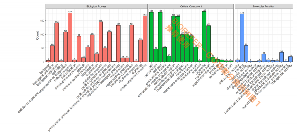
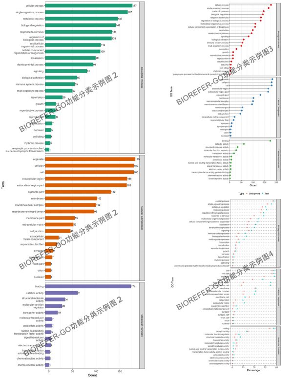
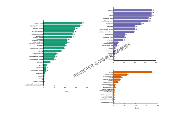
GO 功能分类是在某一功能层次上统计蛋白或者基因的数目或组成,往往是在 GO 的第二层次。此外也有研究都挑选一些 Term,而后统计直接对应到该 Term 的基因或蛋白数。目的是展示数据集大概的 GO 功能情况,以下为几种不同风格的 GO 短信功能分类分析结果图形。
- 图 1. 参考图注,GO categories assigned to all proteins. Y-axis represents the count of proteins. The proteins were categorized according to the annotation of GO, and the number of each category is displayed based on biological process, cellular components, and molecular functions.
- 图 2:风格 2,3,4
- 图3:风格5
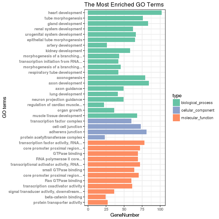
2.2 GO 功能分类柱状图绘制
本图的绘制主要参考:http://www.biotrainee.com/thread-242-1-1.html。
library(ggplot2)

go_enrich_df <- read.table("https://gitee.com/stevenshen/bio-r-charts/raw/master/example_data/go_functional_bar.txt",header = T,sep="\t")

## numbers as data on x axis
go_enrich_df$number <- factor(rev(1:nrow(go_enrich_df)))

## shorten the names of GO terms
shorten_names <- function(x, n_word=4) {
    if (length(strsplit(x, " ")[[1]]) > n_word){
        return(paste(paste(strsplit(x, " ")[[1]][1:n_word], collapse=" "), "...", sep=""))
    }else{
        return(x)
    }
}

labels=(sapply(levels(go_enrich_df$Description)[as.numeric(go_enrich_df$Description)], shorten_names))
names(labels) = rev(1:nrow(go_enrich_df))

## setting colors for bar
CPCOLS <- c("#66C3A5", "#8DA1CB", "#FD8D62")
#也可以通过 colorRampPalette 自定义渐变颜色
#ncolor <- length(unique(go_enrich_df[,4]))
#CPCOLS<-colorRampPalette(c("green", "red"))(ncolor)

## plot
gplot(data=go_enrich_df, aes(x=number, y=GeneNumber, fill=type)) + geom_bar(stat="identity", width=0.8) + coord_flip() +
    scale_fill_manual(values = CPCOLS) + theme_bw() + scale_x_discrete(labels=labels) + xlab("GO terms") + ylab("GeneNumber") +
    theme(axis.text=element_text(face = "bold", color="gray50")) + labs(title = "The Most Enriched GO Terms")
得到 GO 功能分类柱状图如下:
3. GO 功能富集分析
3.1 说明
GO 功能富集目的是为了获得相对于本底参照显著富集的功能类别,通过该项分析可以找出在统计上显著富集的.该功能或者定位有可能与研究的目前有关。以下为几种不同风格的 GO 功能富集分析结果图形。
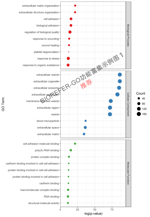
- 图 4. 示例图 1. Top 10 enrichment GO categories. X-axis represents –log10 p-value. The count of proteins corresponds to circular size.
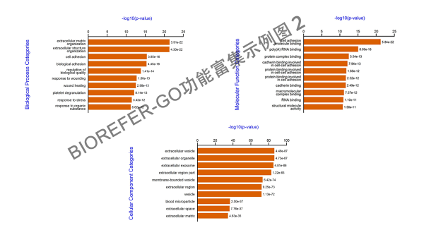
- 图 5. 示例图 2,分别的条状图显示 Top 10 enrichment GO categories.
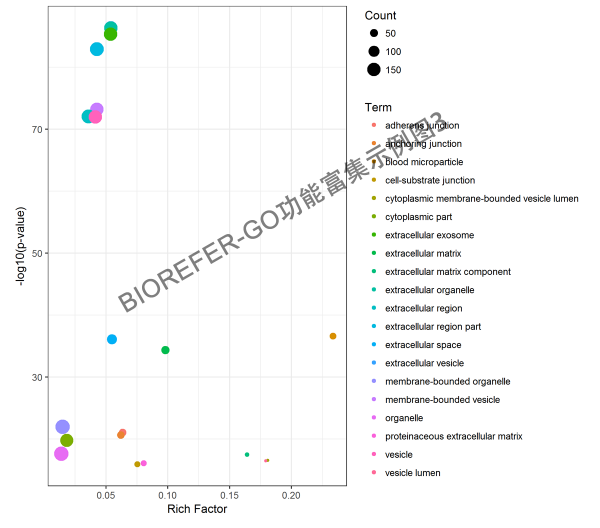
- 图 6. 示例图 3,气泡图 Top 20 enrichment GO categories.
参考资料
- 生信宝典,《R 学习 - 功能富集泡泡图》,CSDN 博客
- ybzhao,《GO 和 KEGG 富集的 R 包 clusterProfiler》,Public Library of Bioinformatics
- 杜德超,《RNA-seq 中 GO、KEGG 结果图如何解读》,诺禾科服,2015-11-29。
- 艾鹏,《R 语言 ggplot2 画图教程之——Pathway 富集分析气泡图》,基迪奥,OmicShare Forum
- 木子愚溪,《ggplot2 绘制 Pathway 富集分析 气泡图》,简书