如何在 5 分钟内建立一个数据驱动的新型冠状病毒肺炎应用程序
许多数据库都与新型冠状病毒肺炎有关,但是目前还没有一个虚拟平台对这些数据源中的大部分数据进行集成。因此想要对 COVID-19 相关的数据进行全面的分析是有难度的,也很难将这些通常是医学信息和外部因素,特别是社会政治因素联系起来。考虑到这一点,新型冠状病毒肺炎数据中心 (COVID-19 Data Hub)致力于开发一个统一的数据集,有助于更好地理解新型冠状病毒肺炎数据。
The goal of COVID-19 Data Hub is to provide the research community with a unified data hub by collecting worldwide fine-grained case data, merged with exogenous variables helpful for a better understanding of COVID-19.
在本教程中,我们将使用 COVID19 的 R 包来构建一个简单而完整的 Shiny 应用程序,这个应用程序是通过 COVID19 这个 R 包来连接新型冠状病毒肺炎数据中心的。
我们假定大家对对 Shiny (web apps) 和 plotly (interactive plot) 有一个基本的了解,下面我们只需要通过简单的复制粘贴就可以构建一个功能完备的 app。 加载以下软件包以便开始:
library(shiny)
library(plotly)
library(COVID19)
COVID19
COVID19 的 R 包通过 COVID19() 函数提供了与新型冠状病毒肺炎数据中心的无缝集成。关于这个函数的更多参数说明,我们可以通过 ?covid19 进行查看。下面我们将使用:
country:vector of country names or ISO codes. 国家名称或国际标准化组织代码的矢量。level:granularity level; data by (1) country, (2) region, (3) city. 粒度级别;按(1)国家、(2)地区、(3)城市分列的数据。start:the start date of the period of interest. 感兴趣的开始日期。end: the end date of the period of interest. 感兴趣的结束日期。
定义用户界面
定义以下输入。
- country:the country name. Note that the options are automatically populated using the
covid19()function. 国家名称。请注意,选项是使用 covid19() 函数 - type:the metric to use. One of
c("confirmed", "tests", "recovered", "deaths"), but many others are avaibale. See here for the full list. 使用的度量标准,可以是c("confirmed", "tests", "recovered", "deaths")中的一种 , 也可以是除此以外的其他值,完整的名单参考这里。 - level:granularity level (country – region – city). 粒度级别(国家-地区-城市)。
- date:start and end dates. 开始和结束日期。
输出。
covid19plot: plotly output that will render an interactive plot. 显示交互式图形的 plotly 输出。
将所有内容打包到 fluidPage 函数中:
# Define UI for application
ui <- fluidPage(

    selectInput("country", label = "Country", multiple = TRUE, choices = unique(covid19()$administrative_area_level_1), selected = "Italy"),
    selectInput("type", label = "type", choices = c("confirmed", "tests", "recovered", "deaths")),
    selectInput("level", label = "Granularity", choices = c("Country" = 1, "Region" = 2, "City" = 3), selected = 2),
    dateRangeInput("date", label = "Date", start = "2020-01-01"),

    plotlyOutput("covid19plot")

)
服务器逻辑
在 UI 中定义了响应式输入之后,我们将这些输入连接到 covid19() 函数以获取数据。下面的代码片段显示了如何呈现交互式绘图 ,当任何输入发生更改时,交互式绘图会自动更新。注意,因为 covid19() 函数使用了内部的缓存系统(memory caching system),因此数据不会被下载两次。多次调用这个函数是非常高效和用户友好的。
# Define server logic
server <- function(input, output) {

    output$covid19plot <- renderPlotly({
        if(!is.null(input$country)){
            x <- covid19(country = input$country, level = input$level, start = input$date[1], end = input$date[2])
            color <- paste0("administrative_area_level_", input$level)
            plot_ly(x = x[["date"]], y = x[[input$type]], color = x[[color]])
        }
    })

}
运行应用程序
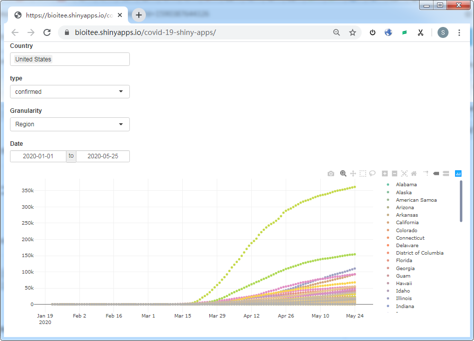
这个示例应用程序在线可以通过下面的地址预览:https://bioitee.shinyapps.io/covid-19-shiny-apps/
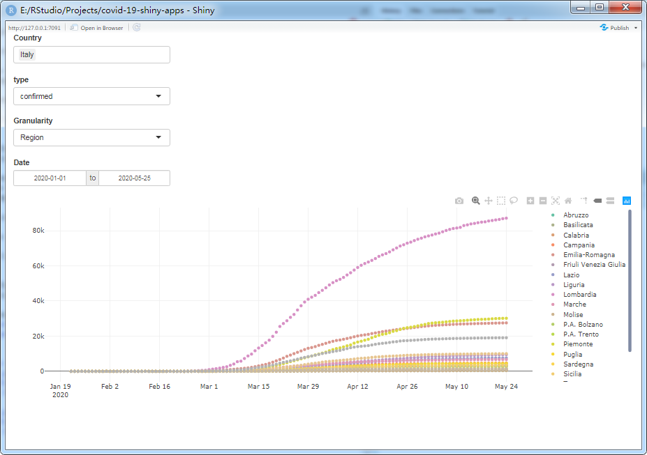
在本地 RStudio 运行后的截图如下:
简单总结
我们构建了一个简单的应用程序,将 Shiny 与 COVID19 的 R 包连接起来,呈现了一个可重用的通用体系结构。这个示例应用程序可以用作更高级的新型冠状病毒肺炎数据驱动应用程序的构建块。特别是,可以通过 covid19() 函数获得的数据集包括关于新型冠状病毒肺炎案例、政策措施、地理信息和其他相关的额外指标,这些指标使得数据集可以很容易地扩展到世界银行开放数据(World Bank Open Data)、谷歌移动报告(Google Mobility Reports)、苹果移动报告(Apple Mobility Reports)和当地政府数据。请参阅完整的数据集文档(full dataset documentation)和 COVID19 代码片段(COVID19 code snippets)。
截止本文章推送前(2020-05-25),小编在 COVID-19 Data Hub 官网看了一下,它们目前已经支持将近 190 个国家的 COVID-19 相关数据,但没有中国的。另外,该开源项目还提供基于 Python、MATLAB、Julia,以及 Node.js 等语言的 API,感兴趣的童鞋可以参考它们在 Github 的源码。
参考资料
- COVID-19 Data Hub 官网:https://covid19datahub.io/
- Shinyapps.io - Getting started:https://shiny.rstudio.com/articles/shinyapps.html